The under rated essential for your business
Why your business needs a Brand Kit
A brand kit is more than just a collection of design elements—it’s the foundation of your business’s identity. It brings structure and consistency to your vision and messaging, ensuring your brand is easily recognizable and trusted by your audience.
Think of a brand kit as your company’s guidebook. It defines the key elements of your identity—logos, colors, typography, and tone—while providing clear guidelines for their use. This consistency helps you maintain control over how your brand is represented across platforms and ensures every interaction reinforces your message. Your kit can start out with the basic components for brands that do not have many demands on them but, as your business grows you will need to adapt your kit and build upon the basic set components to ensure your kit covers each aspect of how and where your brand will be seen or used.
Without a brand kit, your visual identity can become fragmented and inconsistent, leading to confusion and weakening trust. Just as we struggle to trust individuals who frequently change their persona, consumers find it difficult to connect with brands that lack a cohesive identity. A well-crafted brand kit is not just about looking polished; it’s about creating a unified presence that fosters trust, builds recognition, and drives loyalty.
The Essential Elements Your Brand Kit Can’t Go Without
Crafting a cohesive and impactful brand kit takes creativity and expertise. From defining your identity to aligning every detail with your vision, building a successful brand is no small task. Every element needs to work seamlessly to create a visual representation that captures attention and drives results while giving other outlets a clear understanding of what to do and not to do to relay your image to the world.
Key areas to focus on
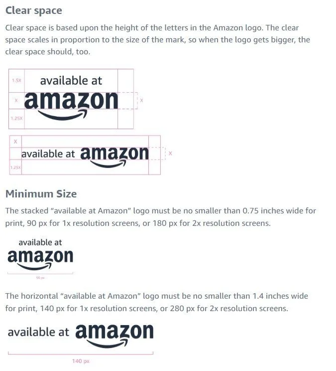
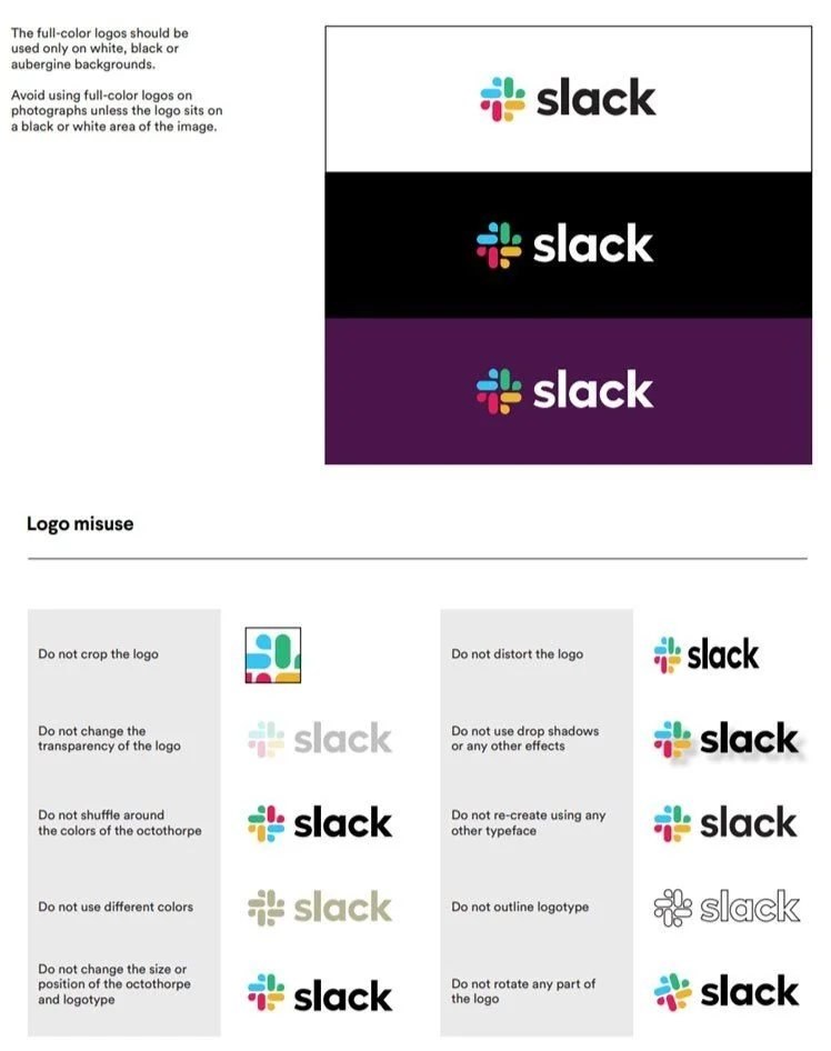
Logo and Variations
Your logo is the centerpiece of your brand’s identity. A comprehensive brand kit includes your primary logo, alternative versions (e.g., horizontal, vertical), and icons, along with guidelines on how to use them across different platforms and materials.
Primary Logo
This is your main logo, used in most instances to represent your brand. It should be clear, versatile, and scalable, working well in both digital and print formats. As a business owner, ensure this version looks great at various sizes, from website headers to business cards.
Alternative Versions
Your primary logo may not always fit every space or format. For example, you might need a horizontal version for a website banner or a simplified icon for a social media profile. Include these variations in your brand kit to ensure your logo adapts seamlessly to any medium.
Icons and Submarks
These are simplified versions of your logo, often used in small spaces like social media avatars, app icons, or watermarks. Icons should still be recognizable and consistent with your primary logo’s design elements.
Color Palette
Your brand’s color palette is more than just a set of attractive colors—it’s a tool that communicates emotion, builds recognition, and creates visual consistency. It typically includes primary, secondary, and accent colors, along with color codes (HEX, RGB, CMYK) for precise reproduction.
Primary Colors
These are the core colors that represent your brand and are most frequently used in your designs. For instance, think of the signature red of Coca-Cola or the blue of Facebook. Choose 2-3 primary colors that align with your brand’s identity and use them consistently on key assets like your website, packaging, and marketing materials.
Secondary Colors
Secondary colors complement your primary palette and provide flexibility in design. They add depth and variety, helping to avoid a monotonous look while maintaining brand cohesion. Use these colors for less prominent elements, such as backgrounds, accent graphics, or call-to-action buttons.
Accent Colors
Accent colors are used sparingly to draw attention to specific elements, like a "Buy Now" button or a promotional banner. These colors should stand out but still harmonize with your primary and secondary palettes.
Color Codes (HEX, RGB, CMYK)
To ensure your brand colors look the same across all mediums—digital screens, print materials, or signage—document the exact codes for each color:
HEX codes: For websites and digital use.
RGB values: For screen-based applications like presentations or video.
CMYK values: For professional printing to achieve accurate color reproduction.
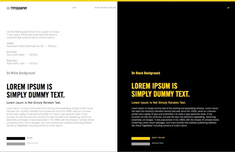
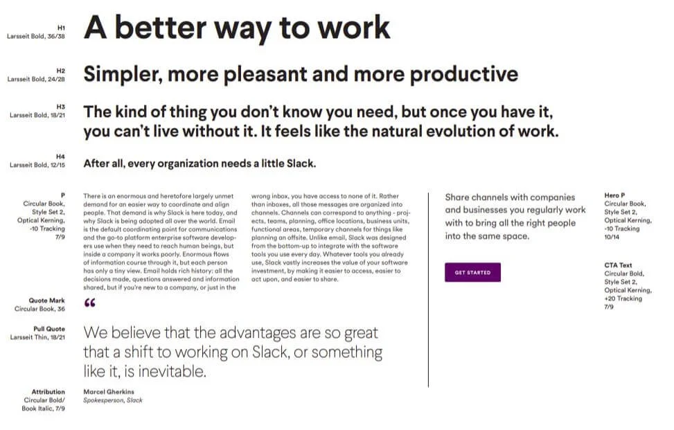
Typography
Fonts communicate your brand’s tone and personality. Your brand kit should specify primary and secondary fonts for headlines, body text, and other uses, along with rules for spacing, size, and alignment.
Primary Fonts
These are the fonts you’ll use most frequently, particularly for headlines and other prominent text. The primary font should be bold, distinctive, and aligned with your brand’s personality. For example:
A modern, clean font might suit a tech startup.
A classic serif font could convey trust and tradition for a law firm.
Secondary Fonts
Secondary fonts complement your primary font and are typically used for body text or less prominent elements. These fonts should be highly readable and harmonize well with your primary font.
Font Pairing
Combining fonts is an art. The primary and secondary fonts should contrast just enough to create interest while maintaining a cohesive look. For example, pairing a bold sans-serif headline font with a softer serif body font often works well.
Rules for Spacing, Size, and Alignment
Typography isn’t just about choosing fonts; it’s also about how they’re used. Your brand kit should specify:
Font sizes for headlines, subheadings, and body text.
Line spacing to ensure text is easy to read.
Alignment (e.g., left-aligned for readability in body text).
Tone and Voice
This defines how your brand communicates with its audience. It includes guidelines on word choice, style, and tone to ensure consistency in all written and spoken communications, whether formal, friendly, or playful.
Voice: The Personality of Your Brand
Your brand’s voice is its consistent personality in communication. Is your brand professional and authoritative? Fun and approachable? Warm and empathetic? Your voice reflects your company’s values and aligns with your target audience.
Tone: Adjusting for the Situation
While your brand’s voice stays consistent, your tone can adapt to different contexts. For example:
A playful tone for a new product launch.
A more formal tone for addressing a serious issue or corporate update.
Word Choice and Style
The specific words and phrases you use can make your communication distinctive. This includes:
Preferred terminology that reflects your industry or values.
Avoiding jargon or overly technical language unless it fits your audience.
Consistency Across Platforms
Your tone and voice should remain recognizable, whether it’s a tweet, an email, or a billboard. A unified communication style builds trust and ensures your audience always knows it’s you speaking.
Brand Assets and Applications
From templates for social media posts to business cards and packaging designs, these assets show how your brand identity comes to life. This section also outlines how to apply your brand across different platforms and materials for consistency.
-
Why They Matter: Social media is often the first place potential customers engage with your brand. Consistency in visuals here builds recognition and trust.
How to Implement:
Create templates for posts and stories that use your brand colors, logo, and fonts.
Design separate layouts for promotional content, announcements, and regular updates.
Ensure templates are optimized for each platform’s specifications (e.g., square for Instagram, horizontal for Facebook).
-
Why They Matter: Business cards are often your first physical touchpoint with potential clients or partners. They need to leave a professional and memorable impression.
How to Implement:
Incorporate your logo, brand colors, and tagline into the design.
Use high-quality materials that align with your brand values (e.g., eco-friendly paper if sustainability is a focus).
Keep the design clean and easy to read, with all essential contact information prominently displayed.
-
Why They Matter: For product-based businesses, packaging is a critical part of the customer experience and a chance to reinforce your brand.
How to Implement:
Use your brand colors and logo prominently on packaging.
Consider the unboxing experience—how can your packaging reflect your brand’s personality and values?
For eco-conscious brands, use sustainable materials and mention this on the packaging to align with customer expectations.
-
Why They Matter: From brochures to flyers, marketing materials are often how your audience learns about your business.
How to Implement:
Use branded templates for all printed and digital materials.
Ensure consistent use of colors, typography, and logo placement across all materials.
Highlight key messages in a way that aligns with your brand’s tone and style.
-
Why They Matter: Your website is often the first place customers go to learn about your business. It should reflect your brand’s identity and professionalism.
How to Implement:
Ensure your website’s design follows your brand guidelines for colors, fonts, and imagery.
Use consistent layouts and navigation that reflect your brand’s tone (e.g., minimalist for a modern brand, vibrant for a creative one).
Incorporate your brand voice into all copy, from product descriptions to blog posts.
-
Why They Matter: Physical assets like signage, uniforms, and merchandise extend your brand into the real world, making it tangible and memorable.
How to Implement:
Use consistent branding on items like uniforms, mugs, or tote bags.
For signage, ensure high visibility and adherence to your brand colors and logo placement guidelines.
Include your brand’s tone and messaging in any printed collateral, like event banners or trade show displays.
-
Why They Matter: Without clear guidelines, it’s easy for your brand to become inconsistent, especially when working with multiple team members or external vendors.
How to Implement:
Outline how to use each asset correctly, including do’s and don’ts for logo placement, color usage, and typography.
Provide examples of how your brand should appear across different mediums, such as social media posts, advertisements, or product packaging.
Share your guidelines with your team and any external partners to maintain consistency.
In closing
A brand kit is a powerful tool that defines how your business is seen and remembered. By unifying your visuals, tone, and messaging, it ensures consistency and professionalism across all touchpoints, fostering trust and recognition with your audience.
Whether you’re starting out or refining your brand, a well-crafted brand kit sets the foundation for long-term success and streamlines your efforts, strengthens your presence, helping build meaningful connections with customers.
Take the time to audit your materials, centralize your assets, and work with experts to bring your vision to life, because a strong, cohesive brand identity isn’t just an investment in how your business looks—it’s a strategy for growth and trust.


